Product Photography for Art & Prints
Art print photography has a unique challenge: the product is the photograph. The art buyer is evaluating a two-dimensional object — its colors, composition, paper quality, and how it will look on a wall — almost entirely through a digital reproduction. Any failure in the photography directly undermines the buyer's ability to accurately evaluate the art.
This creates both a technical and an aesthetic demand. Technically, color accuracy is critical — if the photograph of a blue painting reads as teal on most screens, the buyer who purchases based on what they saw will feel deceived. Aesthetically, the photography should help the buyer answer the most important question in art buying: 'how will this look on my wall?'
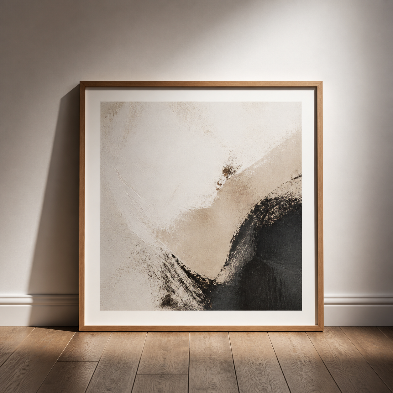
6 tips for art & prints product photography
Color accuracy is non-negotiable — shoot in RAW and calibrate
For art prints, a color shift between the photograph and the actual print is a trust-destroying defect. Shoot in RAW, set a custom white balance, use a color reference card in the first frame, and calibrate your monitor for post-processing. If buyers frequently comment that colors 'looked different online,' the photography has a color accuracy problem that props cannot solve.
Shoot flat prints on a flat surface with no perspective distortion
Any camera-to-print angle creates perspective distortion that makes rectangular prints look trapezoidal. Shoot flat-on with the camera perfectly parallel to the print surface. If using a standard lens, correct perspective in Lightroom or Photoshop before exporting. Skewed prints look amateurish and make the work harder to evaluate accurately.
In-situ shots are often the decisive image
Buyers of art prints are imagining how the piece will look in their home. A shot of the print hanging on a wall — even a clean, minimal wall — helps this imagination dramatically. Include at least one on-wall shot per listing, and show a small amount of surrounding room context to help buyers evaluate the print's scale and color in an environment.
Show scale with room context or a size reference
Art print sizing is nearly impossible to judge from a flat shot of the print alone. A 30x40cm print and a 60x80cm print look nearly identical without reference. Show the print on a wall with a piece of furniture below it, include a tape measure in a secondary image, or note dimensions on the print image itself. Scale ambiguity generates returns.
Close-up shots show paper and print quality
Art buyers care about material quality — the weight of the paper, the texture of the surface (matte, lustre, fine art cotton), the depth of the black tones. A close-up shot at an angle that shows the paper texture and edge of the print reveals these details. For premium limited-edition prints, this shot can visually justify the price point.
Photograph framed and unframed versions separately
If the print is offered framed and unframed, photograph both separately. The framed shot should show the complete print-frame combination as it will hang on the wall. The unframed shot should show the print clean and flat with accurate colors. Many buyers purchase based on the framed presentation even if they plan to reframe.
Equipment and setup for art & prints photography
Camera: ideally a tilt-shift lens for perspective-perfect flat reproduction. Alternatively, a 50mm prime with careful alignment and perspective correction in post. Lighting: two matched lights at 45 degrees to the print, equidistant, for even illumination without hot spots. A light meter is essential — even illumination is critical for flat art reproduction.
Common mistakes to avoid
- Perspective distortion — print corners that don't form right angles make the work look amateurish and make the art harder to evaluate accurately. Correct in-camera or in post.
- Inaccurate color reproduction — if photos look warmer, cooler, more saturated than the actual print, buyers will feel deceived. Calibrate the entire workflow.
- No scale reference — art buyers are buying wall art, and wall art needs to be the right size for the wall. No scale reference generates wrong-size returns consistently.
Styles that work for art & prints
In noprompt.design, start with: Warm Minimalist, Clean White Studio, Marble Luxury. Each style is pre-tuned for this product category — no settings to adjust.
Try it free — upload your art & prints product now
Frequently asked questions
How do I photograph art prints without glare?
Two lights at 45 degrees from the camera, placed equidistant on each side of the print, eliminate the central hot spot that a single front light creates. Fine-art prints on matte surfaces rarely glare. Lustre and gloss prints are more challenging — position lights carefully and check the result on live view before shooting at full resolution.
What's the best way to show art print scale?
In-situ shots on a wall with nearby furniture give the best intuitive sense of scale. A sofa beneath the print, or a side table beside it, provides the reference most buyers need. Additionally, including a ruler or noting dimensions on the print image itself is effective. For a product catalog, consistent scale across all prints in the same room setup helps buyers compare sizes directly.
How do I make art prints look gallery-quality?
Consistent, color-accurate flat reproduction as the primary technical image, combined with a well-composed in-situ shot on a clean, lightly styled wall. The gallery look comes from restraint: minimal wall styling, no competing art nearby, good light quality, and a print that hangs straight. The goal is to make the art look exactly as it would in a real gallery.
Should art prints be photographed framed?
Yes, if you offer framing. Many buyers who see a well-framed piece will upgrade to the framed option even if they initially planned to frame it themselves. Show the framed version on a wall with context. Show the frame detail close-up. And show the unframed print separately so buyers who want to choose their own frame can evaluate the print itself accurately.
Can I create professional pop art product photos without a camera?
Yes — the camera is no longer the bottleneck for art prints. Color accuracy, straight-on flat reproduction, and a convincing in-situ wall shot matter far more than sensor size: a modern phone held perfectly parallel to the print in even window light can capture everything a buyer needs to evaluate the work. For consistent studio-grade results across a whole catalog, AI product photography tools like noprompt.design turn an ordinary phone photo of a print into a clean, professionally lit product image without writing a single prompt.
How do I photograph art prints for Etsy?
Etsy art buyers are evaluating the piece as it will look in their own home, so lead with a color-accurate flat shot, then one in-situ wall shot with a little room context for scale. Keep backgrounds minimal and consistent so your shop reads as one gallery, and photograph framed and unframed versions separately since many buyers purchase based on the framed presentation. Shoot in RAW with a color reference card in the first frame — an Etsy buyer who sees colors 'looked different online' will leave a bad review.
How do I edit art print photos to look professional?
Edit for accuracy first, style second. Correct perspective so the print is perfectly rectangular, set a custom white balance against a color reference card, and calibrate your monitor so the on-screen colors match the actual print — trust in the artwork depends on it. For pop art and bold-color prints, lift saturation gently and keep blacks deep, but never shift hues away from the physical piece. Finish with a clean in-situ wall shot at a realistic viewing angle so buyers can picture the piece in their space.
Related deep-dive: JPEG or PNG for product photos — picking a file format that keeps art and print detail intact.